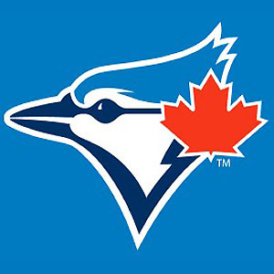
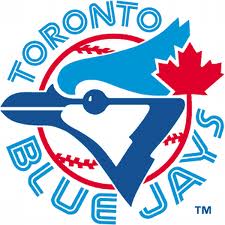
Look above. You’ll see the new Toronto Blue Jays logo for 2012. As you’ll see below it pays homage to the Blue Jays logo of yesteryear. An updated version of their original logo from the 1970s, with a lettering font appropriated from the city of Toronto’s flag.
They also brought the Canadian flag to re-incorporate their Canadian roots.
I really like this new look, I think it’s a great move away from the “Angry Birds” style of logo they’ve had in recent years.
Another Canadian team has updated/augmented their logo. Check out the Winnipeg Jets new look here
Paul M. Banks is CEO of The Sports Bank.net, an official Google News site that generates millions of unique visitors. He’s also a regular contributor to Chicago Now, Walter Football.com, Yardbarker, and Fox Sports
He’s appeared on live radio all across the world from Houston to New Zealand. The President of the United States follows him on Twitter (@Paul_M_BanksTSB) You should too.


