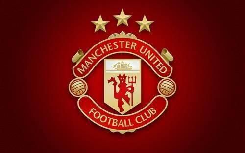
A new take on the Manchester United badge or crest. This comes to us from the Twitter account of Genius football. What do you think of the new Manchester United emblem? Do you like it more or less than the previous logo(s). You’ll notice the clipper ship up at the top now has more sails, and more detail is added on the old time sailing ship. The ship’s hull is better defined in this crest as well.
The trademark red devil which gives the club it’s nickname remains pretty much unchanged, but now you have three stars up at the top of the Manchester United badge.
You’ll notice the balls are more detailed too, a couple more lines have been added to each one. So what do you think of this new Manchester United badge/crest? Is this fitting for the defending champs, and the world’s most popular sports team? Is it worthy of the biggest brand in the Premier League? Or do you think it’s just crap? As always, comment below.
Paul M. Banks is the owner of The Sports Bank.net, an affiliate of Fox Sports. He’s also an analyst for multiple news talk radio stations across the country; with regular weekly segments discussing: Illinois, Northwestern, Notre Dame, Bears and Bulls on NBC and Fox Sports Radio. President Barack Obama follows him on Twitter (@paulmbanks)

