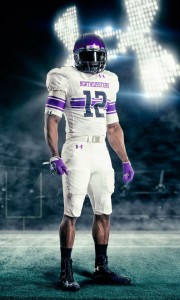
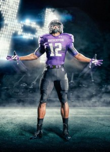
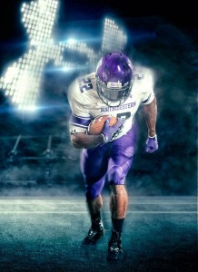
Northwestern and Under Armour recently unveiled the new uniforms that the Wildcats will wear this season. Cutting their ties with Adidas after last season, Northwestern is the first Big Ten school to have Under Armour as their official apparel provider.
Although what Under Armour created for Northwestern is kind of sharp looking, I am, for the most part, disappointed.
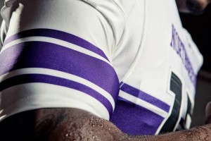
The purple jerseys and black pants are decent, and the white jersey with purple pants is kind of nice, too, but what’s with the stripe going across the jersey?
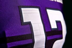
Apparently, Under Armour wanted to pay homage to Northwestern’s football heritage with the striped design, but why not put it on the side of the pants, or maybe down the center of the helmet? The uniforms also picture elements of the Northwestern campus, such as the gothic-style stone pattern on the numbers (to match the stonework used on many campus buildings). The idea is cute, but largely ineffective for the viewer.
And why is there no black jersey? I would hope one of those is coming. I was also hoping for their “Wildcat head with the ‘N’ logo” in there somewhere. Maybe something like what Darnell Autry and the ’95 Wildcats wore on their way to the Rose Bowl…
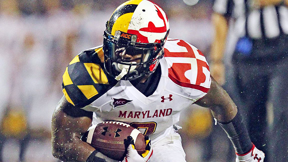
I am not a fan of the super-flashy ensembles that Under Armour has come up with for schools like Maryland. But what they’ve designed for Northwestern errs on the side of being too tame.
Here, they’ve not made the revolutionary changes to a uniform that people are used to seeing from Under Armour. They put the name across the front with a stripe. That’s it. I don’t dislike the new uniforms, but Under Armour could have come up with something more unique, considering their reputation and that it took them months to develop the new look. What do you think?
